



Introduction
Professional Magazine Layout Ideas help publishers and designers create publications that look polished, communicate information clearly, and keep readers engaged. A well-planned layout combines typography, images, spacing, and content hierarchy to guide readers naturally through each page. Whether you are designing a lifestyle magazine, business publication, fashion editorial, or digital issue, the arrangement of elements can influence how readers experience your content. A professional design does not need to be complicated; it needs to be consistent, readable, and appropriate for the publication’s audience. By choosing a clear visual direction and applying reliable design principles, you can create pages that feel organized, attractive, and memorable.
Create a Strong Grid and Page Structure
A grid system provides the foundation for a professional magazine layout. It helps designers align headlines, body text, photographs, captions, and sidebars without making every page look identical. A simple two-column or three-column structure can work well for articles, while feature stories may benefit from wider text areas or full-page images. Consistent margins and spacing make the publication feel balanced and easier to navigate. Designers should also consider how readers move between sections, ensuring that important headlines and visual elements appear in logical places. A flexible grid creates order while leaving enough room for creative choices that make individual stories distinctive.
Use Typography to Improve Readability
Typography influences both the personality and readability of a magazine. Headlines should attract attention, subheadings should organize information, and body text should remain comfortable to read over longer passages. Choosing one display typeface and one readable body font can create a strong visual contrast without making the pages feel inconsistent. Font size, line spacing, paragraph width, and alignment also affect the reading experience. Avoid using too many font styles or decorative typefaces that compete with the content. Pull quotes, introductory paragraphs, and carefully styled captions can add visual variety when used selectively. A clear typographic hierarchy helps readers understand what matters most and find information quickly.
Balance Photography, White Space, and Graphics
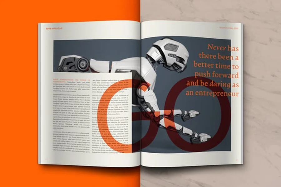
Images often establish the mood of a magazine before readers begin the article, so their placement deserves careful planning. Use high-quality photographs that support the story and maintain consistent image treatment throughout the publication. A large image can create a strong focal point, while smaller supporting photographs can add context without overwhelming the page. White space is equally valuable because it separates elements and prevents the layout from appearing crowded. Infographics, icons, and decorative shapes can make complex information easier to understand, but every graphic should have a clear purpose. When imagery and empty space work together, the page feels more professional, organized, and visually comfortable.
Design Engaging Covers and Feature Pages
A magazine cover is often the first impression a reader receives, so it should communicate the publication’s identity quickly. Use a clear main headline, a strong central image, and supporting text that remains readable at different sizes. Avoid adding so many cover lines that the design loses its focal point. Inside the magazine, feature pages can use larger headings, distinctive image placements, and varied text arrangements to create a sense of importance. Consistency in colors, fonts, and branding helps readers recognize the publication, while occasional creative variations keep each issue fresh. Editorial websites such as Fabsmagazine can also provide general inspiration for presenting magazine-style content online.
Adapt Layouts for Digital and Print Publishing
Professional layouts must account for the format in which readers will view the magazine. Print editions require careful attention to page dimensions, image resolution, bleed, and safe margins, while digital editions need responsive layouts that work across phones, tablets, and desktop screens. Small text, tightly packed columns, and oversized images may cause problems on mobile devices. Designers should preview digital pages at different screen sizes and test links, navigation, and interactive features before publishing. Accessibility also matters: readable contrast, descriptive image text where supported, and logical heading structures make digital content easier to use. Planning for the final format from the beginning can prevent costly revisions later.
Final Thought
Professional magazine layouts combine structure and creativity to make editorial content more appealing and easier to read. A reliable grid, clear typography, balanced images, thoughtful white space, and consistent branding provide a strong foundation for any publication. Designers should also consider the intended audience and the difference between print and digital reading experiences. Rather than copying every design trend, choose elements that support the story and strengthen the magazine’s identity. Reviewing sample pages, testing readability, and collecting feedback can reveal areas that need improvement. With careful planning and regular refinement, publishers can produce attractive, practical layouts that give readers a smooth and memorable experience.
FAQs
What makes a magazine layout look professional?
A professional layout uses consistent spacing, readable typography, balanced images, clear content hierarchy, and a visual style that matches the publication’s purpose.
How many columns should a magazine page have?
The ideal number depends on the page size and content. Two or three columns often work well for articles, while feature pages may use more flexible arrangements.
Which fonts are best for magazine layouts?
Readable serif or sans-serif fonts can work well for body text. Pair them with a complementary headline font and maintain consistent typography throughout the publication.
Why is white space important in magazine design?
White space reduces clutter, separates content, improves readability, and allows important headlines or images to stand out.
How do I design a magazine for mobile readers?
Use responsive layouts, readable text sizes, clear navigation, suitable image dimensions, and enough spacing for comfortable reading on smaller screens.
What software can I use to create magazine layouts?
Designers commonly use desktop publishing and graphic design software such as Adobe InDesign, Affinity Publisher, and similar tools, depending on their budget and workflow.
